Unlock powerful websites and sales funnels built to convert, with zero upfront costs. Let’s bring your vision to life and drive real results together.

Website designs can make or break an online business. Websites that are so outdated they’re not even worth visiting are something no one wants to see.
Technology changes at a breakneck pace. Before you know it (or even if you do), what was once the next new thing is suddenly horribly old-fashioned.
As you look for trends and design styles that work, don’t forget to identify the ones that aren’t working anymore.
Subtle changes happen gradually, so it may be difficult to notice them when they’re happening. It is especially true if you’re not outsourcing your Website design or using an online website management service.
Because if you manage the design, you might be limiting yourself by only designing from your perspective.
It may make it difficult to analyze what you’ve gotten wrong.
Nothing is constant except change itself.
Maybe it was never really up-to-date, but chances are high you liked it at one point.
So what happened?
Probably one of these:
Here we discuss 15 signs you can look for to determine whether your Website is going through a design change:
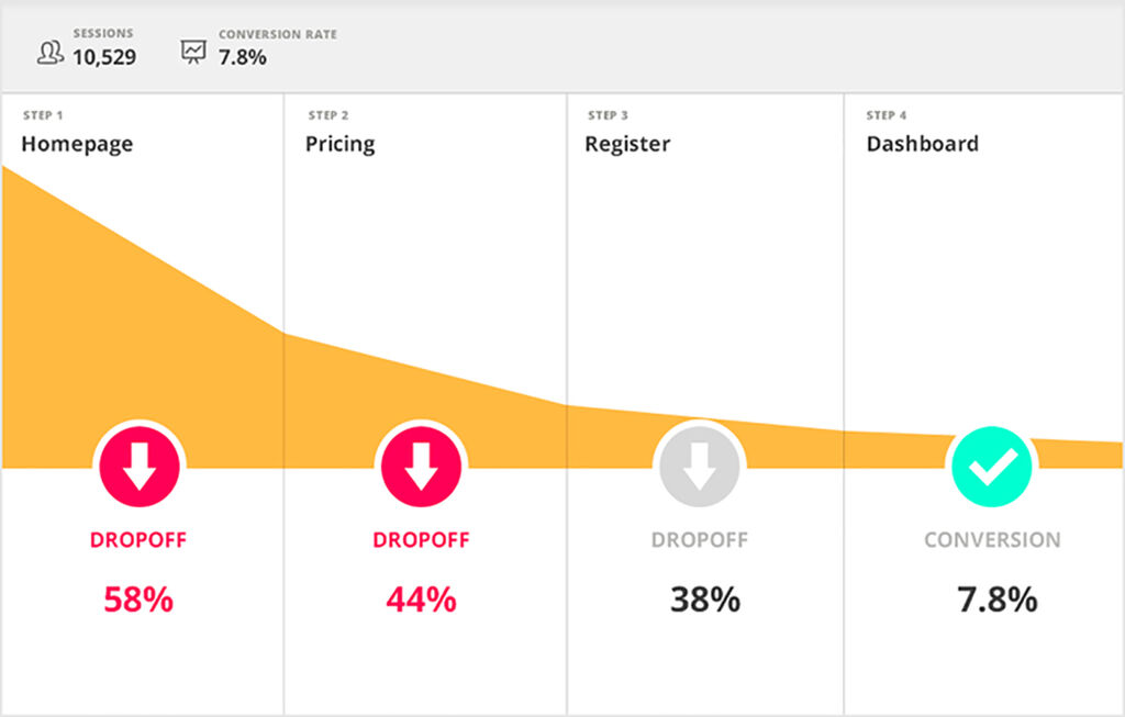
Take our conversion-focused web design test and see if your Website is designed for conversions or looks good.
You’re not generating enough leads and sales. If you’re interested in growing your business through your Website, the conversion rate of the pages on your site should be your most important measure of success.
You don’t have 100% control over the number of people who visit your site every month outside of paid traffic channels.
You don’t control Google’s algorithm, and you don’t control how many people will view your organic social media posts, but you can control your content and how you share it.
What you do control, though, is your web design and content?
If you can’t make your visitors interested enough so they’ll want to buy from you or contact you, then what is your Website for?? So have you noticed fewer and fewer people converting to your pages? If yes, you want to consider a website makeover.
Of course, you can only answer this question if you track your conversion with tools. But if you don’t, ask yourself.
How will you ever know how to optimize your Website for higher conversions over time?
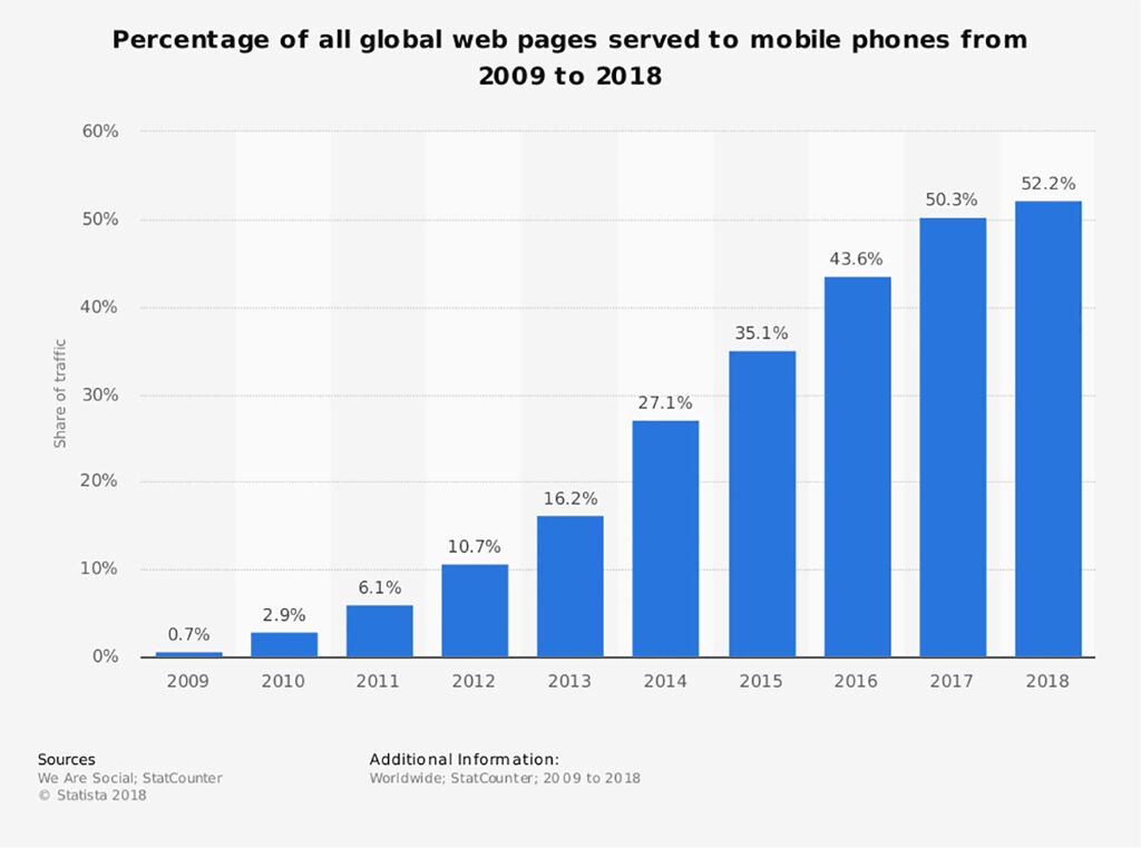
You might think that that’s a given in 2019. But unfortunately, the number of websites I come across that are still not wholly mobile responsive is shocking.
Mobile phone usage has increased significantly in recent years, with 52.2 percent of all web traffic coming from mobile devices in 2018 compared to 50.3 percent in 2017.
Therefore, you not only need a website that Google detects as mobile-friendly. You need a ‘Mobile-First’ web design approach.
Websites aren’t built the same way they used to be five years ago. Technology has evolved and allows us to design even more advanced designs.
With the help of WordPress, managing and updating content isn’t as difficult as it used to be. However, agencies still build websites on their content management system instead of using WordPress.
They then make their clients dependent on them and charge up to 150 dollars for any minor update. If you’re in such an agreement, it is worth looking for alternative options.
It can save you lots of money in the long run.
Your business is evolving.
Looking back a couple of years, some things are not the same anymore:
As the average website use time increases from 2-3 years to the current speed of change in the business world, it’s clear that we need to be constantly refreshing our website design.
And I’ve never talked about your web design, so I’m not sure why you think I’m talking about your branding. That doesn’t mean that you need to do a complete rebranding. But it would help if you always were keeping up with current trends.
Instead of just accepting your outdated Website, accept that your Website will always go out of fashion. Sooner or later.

Many people have trouble navigating websites because they don’t know where things are.
Design is not the only thing that matters for good web design.
Most web browsers are designed to help people find critical information quickly and easily.
As Steve Jobs said it so well:
It’s not just what it looks like and feels like. Design is how it works. So make sure your site is easy to navigate.
Testing is the only way to ensure that you provide the best user experience for your users. Try not to avoid uncomfortable situations when receiving constructive criticism.
Make sure that your Website has good navigation so that visitors can easily find what they’re looking for.

Sliders or website banners used to work well. However, excessive use can lead to negative consequences, as with any trend.
The idea is to design a website that incorporates your brand in its color scheme, themes, and fonts to look like your own.
It is more spammy than helpful when brands attempt to shove too many promotions down our throats.
The bottom line is that clutter kills a website.
84.6% percent of people who visit a website leave if they feel that the site is too crowded or busy-looking.
Pretty much all experts agree on this point:
Image sliders kill your conversion rate!
You can learn more about the reasons in this article by ConversionXL.
Slideshows that include many text and pictures can be a big turn-off for potential clients.
Poor design, overwhelming text, and overuse of graphics are clear, unmistakable signs that your Website is suffering.
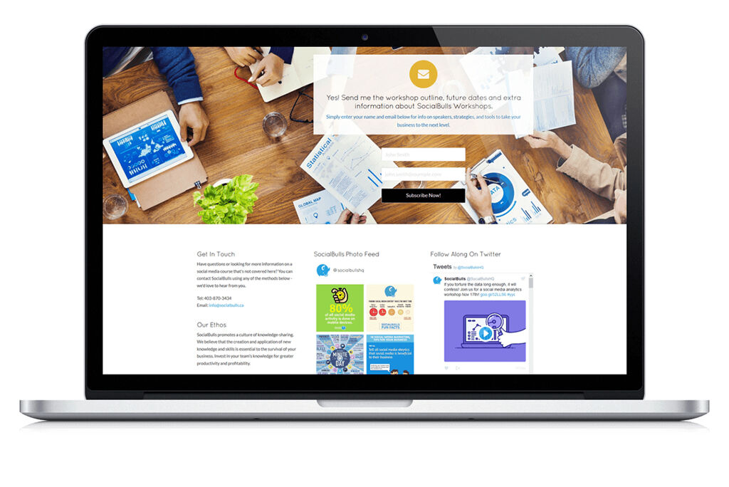
It is a clear sign that you ended up with an outdated website.
We know that you’d love to grow your following on Twitter, Facebook, and Instagram and get on the top of your social media.
But don’t believe us when we tell you that displaying your feeds at randomly placed locations on your homepage isn’t doing you any favors.
It doesn’t mean that you shouldn’t indicate any social media presence.
However, it gives off the impression that you’re either trying too hard or just having to fill up space with content.
A simpler, much fresher alternative is simple icons with clickable links.
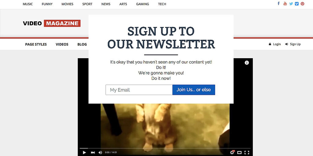
You’ve finally gotten a customer on your site but then annoyed them by popping up an over-enthusiasm pop-up after just three seconds.
Don’t get me wrong. Pop-ups still work!
Especially when they are personalized.
Our site pop-ups convert, on average, 5% of all website visitors into subscribers.
The problem is more with:
If you don’t offer something valuable to your subscribers, nobody will sign up for your company newsletter.
Furthermore, you will also want to consider where these pop-ups appear and on which pages they show up.
Fortunately, this is easy to fix and doesn’t require a complete website redesign.
But it is part of your overall user experience that doesn’t stop at the design.
Pop-ups that disrupt the user experience without offering any value indicate an outdated website.
Or just a business without any thought for its website visitors and thinking about ways to provide more valuable content.
The one image design or a “hero” image, if you prefer, isn’t that bad.
The problem occurs when it’s not just your Website’s face but also the entire body of your Website that makes noticing the actual content hard.
It often comes at the expense of pushing down essential and relevant content that your readers came to see.
A less intuitive user might even leave the site if there’s no clear indication that they need to scroll down to access the content.
Your Website’s central focus should be drawing a clear line between what you want people to see and what they don’t want them to see.
The rules with sidebar menus aren’t as clear-cut as the rest. It depends on the kind of Website you have.
However, if you don’t run a magazine-style blog site, the rule is simple:
No sidebars on your homepage!
Using a sidebar can help display additional content on your blog.
However, as you can see, since we decided to go without a navigation bar, we preferred to keep the user’s focus on the content rather than on the navigation bar.
You may need to try different options like “recently viewed” or “related posts” and see which ones work best.
You’ll usually want to keep things as simple and “visually clean” as possible.
However, where you have to draw the line is at using two sidebars and centering your content.
It means that your Website needs to be changed. Imagine the horror of scrolling through an online store with two cluttered sidebars that contain flashy animations.
Yes, web design costs can already be super expensive if you don’t have to pay for photos.
But using pictures that are so blatantly stock images isn’t worth it.
They aren’t professional-looking, they’re unrealistic, and while you might have to limit yourself to an affordable budget, your customers don’t need to know that.
Now, this doesn’t mean you should avoid stock images. It just means you need to get better at choosing them.
Great places to find free and non-cheesy images are:
You need to take better photos that look more realistic, less common, and align with your brand.
But using images from popular sites like Unsplash that get thousands of downloads every day is not a good idea either.
53% of a web page’s visitors leave if it takes longer than 15 seconds to load. It’s safe to assume that this number will most likely increase over time.
If your Website loads slowly because it contains large images and graphics, it probably has a slow loading speed.
User experience (UX) is the trend of the moment, and slow internet connections directly contradict that.
It can be especially harmful because some places have slower internet speeds depending on where you live.
To determine your Website’s performance, you must identify its speed based on the geographic region of your audience.
It is also helpful to use standard web design elements to ensure uniformity and a faster loading time.
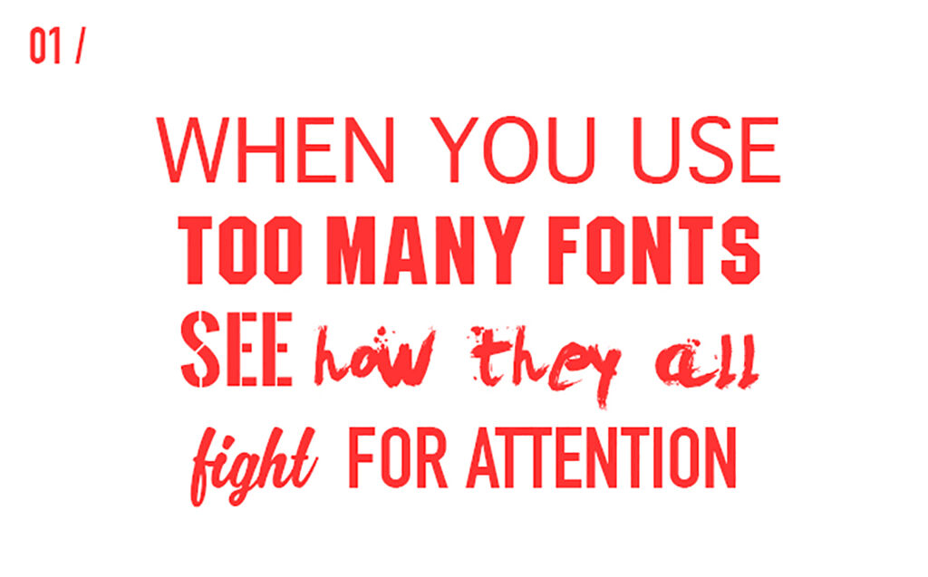
Poorly designed fonts on your Website are just one more example of poor branding.
If your brand has not yet identified its font, it’s high time it did.
Inconsistent font choices reflect an amateur designer’s lack of skill. They are also visually unappealing.
People appreciate symmetrical, consistent, and uniform structures and designs.
There are thousands of free fonts available. You have no excuse for using any other font than your chosen ones.

It wasn’t such a problem until recently. With all the privacy concerns, people are becoming more paranoid, afraid, etc.
An SSL certificate is now the absolute bare minimum your Website needs to inspire any amount of confidence from the average user.
If you don’t know what it is, SSL stands for secure sockets layer, and an SSL certificate is an HTTPS protocol that ensures a secure connection from a web server to a web browser.
It doesn’t just impact your rankings, but it also impacts your user trust.
Without this certification, your site is also likely to proceed with a fatal warning “this website is not secure.”
It will cause most users to opt-out of visiting your site immediately. An SSL certificate helps keep your site safe from potential hackers.
It’s a win-win situation because you get to keep your money.
Hamburger icons don’t necessarily serve a purpose, but they won’t be necessary on mobile websites if you use them.
They’re popular because they work well on mobile devices to reduce clutter and are considerably easier to navigate on a small screen.
You have plenty of room for icons on a desktop screen, and that small one may just be overlooked. It would be even worse if users had to go through a long list of options to search.
Finally, the structure of a Hamburger menu can be tricky for someone who isn’t tech-savvy, so here’s an example of how it works.
The idea is to keep your Website as simple as possible. You never know who’s going to pay a visit!
Take our conversion-focused web design test and see if your Website is designed for conversions or not.
You might have discovered that you either already have some of these designs or that you’re going to need to create a few of them yourself!
It begs the question, what do you do with outdated websites?
Would you redesign the whole thing or just a few things?
Don’t sweat it.
We’re here for you.
Contact us anytime, and we’ll help you determine ways to improve your Website’s effectiveness.
We’re here to help you build a successful business online peacefully. By providing you with the tools, systems, templates, support, and training needed to automate, succeed and scale without complexity, chaos, or stress. Contact us at Appledew today.